PROJECT
Create a lovable, friendly identity that sets TrackMaven apart from other Marketing SaaS companies.
ABOUT
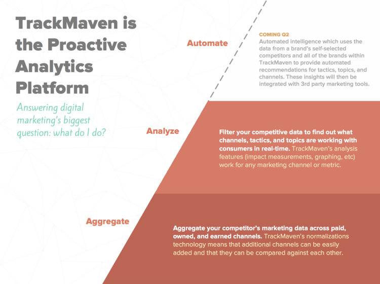
TrackMaven is an integrated marketing analytics platform that helps marketers create better digital content and benchmark themselves against their competitors.
ROLES
Lead Designer
Design Manager
Creative Director
Design Executive
SKILLS USED
Design Strategy
Brand Design
Web Design
Print Design
Photography
Portraiture + Staged
Product (UI/UX) Design
Leadership
Mentorship
“TrackMaven is a design focused company because of Laura’s ability to advocate for the importance of giving our customers an exceptional experience with every touchpoint.”
When I joined TrackMaven in December of 2012, I was the sole designer. In this role, I was responsible for every visual decision as well as a strong collaborator in the final experience our customers received. Eventually this expanded into a team of designers and front-end developers to execute in this role as I oversaw. This role evolved to include with it:
our website,
our social media efforts,
any print materials including gifts and collateral sent to customers and prospects,
exhibit and event design such as trade shows, SXSW and our own conference, SPARK,
internal documents to help clarify message, such as presentations and onboarding materials,
the user experience of our core digital product offering,
and our office design.

Creating Flexible Guidelines for a Strong Identity
This role included both functional and aesthetic decisions, and with it came the need to educate staff in the importance and value of design. This was done through onboarding meetings with me, efforts to ensure quality, and the ownership of the brand put into the hands of each and every Maven. One way we did this was through our brand book. This collaborative effort of the design team with other departments ensured we properly documented standards, as well as rules of thumb and informational tidbits that helped empower each person to own the brand.
Through the efforts of my team, we landed on a robust book of Communication Design Standards that would be delivered to each Maven to ensure a successful and strong brand.
The Importance of Setting Brand Standards
Consistent visual and vocal cues build lasting credibility and foster ongoing engagement with our audience.
Guidelines provide latitude for designers to avoid “reinventing the wheel” during creative processes.
Brand standards break barriers by setting communication expectations.


THE VALUE OF COLOR
By attaching emotions to our colors, we helped reiterate core concepts of Trust, Creativity, Vitality, Excitement, Optimism, Energy, Inspiration, Freshness, Loyalty, and Serenity. We saw an opportunity to continue this meaning through different color combinations and visualized those for easier use in the future.
These color combinations aligned well with the different types of materials we put out, from recruiting materials that needed to be exciting, to research materials that posited questioned for the inquisitive marketer.
OUR FOCUS ON ILLUSTRATION
When forming the brand in the early days, I made the decision to focus on illustration as a way to continue what our logo and mascot was already doing — creating a sense of approachability, familiarity and friendliness.
Illustration was one of the cornerstones of the TrackMaven identity, and we used a lot of it! As TrackMaven's creative director, I worked closely with designers on my team to produce illustrations for blog posts, collateral and the website that visually said TrackMaven.


HOW PHOTOGRAPHY FITS IN
Because the identity was founded on illustration to illicit a friendly and familiar sense, we wanted to be very clear about how photography could be used - as it still played an important role.
During one of our website redesigns, I took on the task of retaking all company photos. Through the use of colored backgrounds associated with each department, we ensured the individual was properly represented but didn't seem out of place on a bold, colorful website (aka no outdoors backgrounds).
Towards the end of my tenure, I also began developing a photographic style that used the same bold backdrops, but was more element based, as seen in a 'culture' photo for our website, to the left.
TYPOGRAPHY
When I joined TrackMaven, some of the fonts had already been put into play, particularly the perhaps-overused Proxima Nova. I wrestled with whether or not to replace it, but ultimately it provided a friendly foundation and flexibility through varying weights and styles for the brand.
To compliment the structure that Proxima Nova provided, we also used an italic font called Facit. This style was used for callout and accent messages in small doses.


The Brand in Action