Features Overview
The following is placeholder text known as “lorem ipsum,” which is scrambled Latin used by designers to mimic real copy. Integer tempus, elit in laoreet posuere, lectus neque blandit dui, et placerat urna diam mattis orci. Suspendisse nec congue purus. Donec ac fringilla turpis. Phasellus sodales massa malesuada tellus fringilla, nec bibendum tellus blandit. Mauris id fermentum nulla.
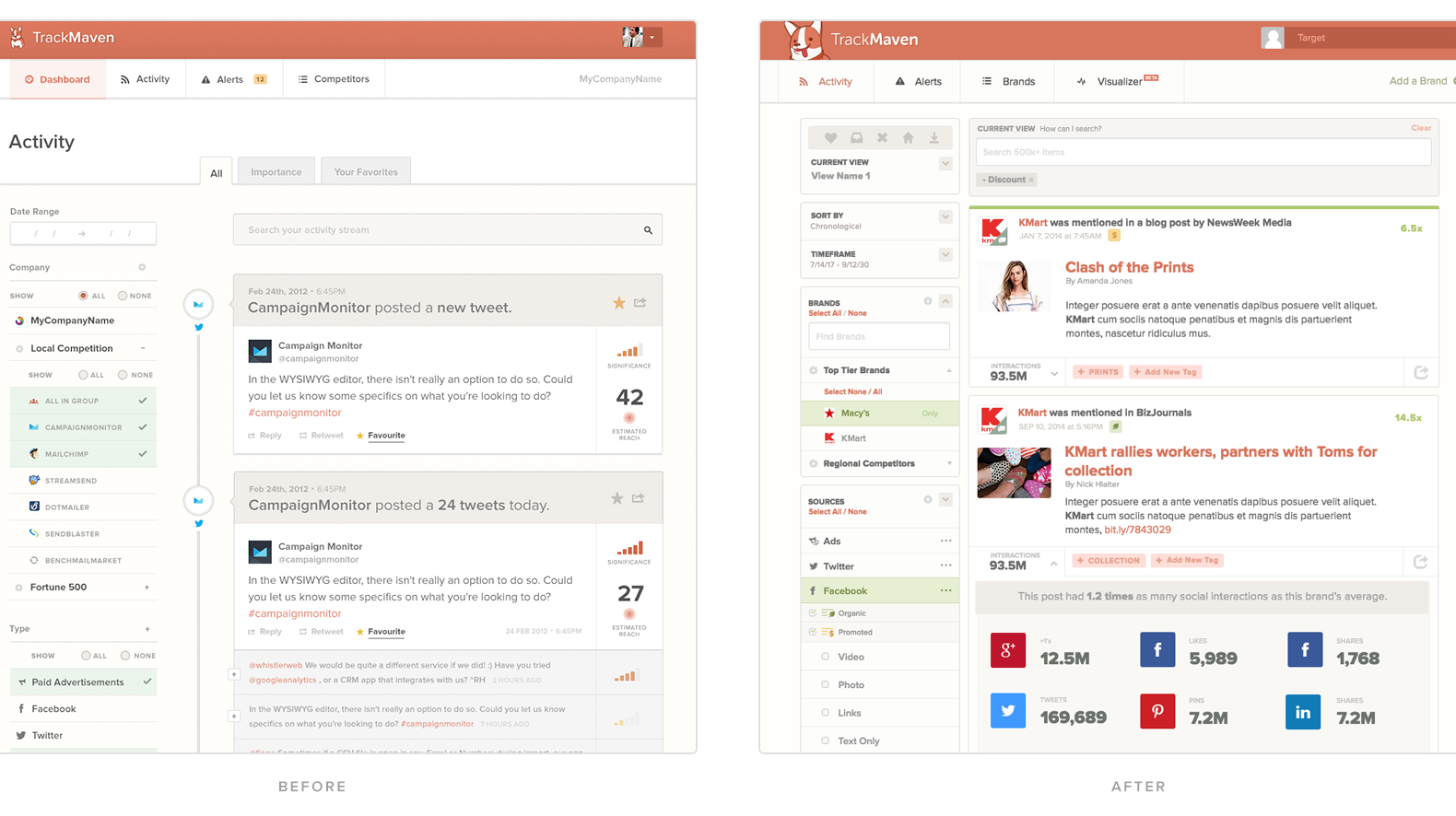
Version one of the activity feed was a mess; in an effort to quickly get the product to market, but still brand it unique, I made a lot of decisions that in retrospect I would not have. That's the way it always is, no? In V2 of the Activity Feed, we had a few goals:
Improve understanding of the impact of the content.
- To do this, I decided to incorporate a colored line at the top of the content cards that helped you understand whether a piece of content was effective or not. The colors ranged from green, to red, to yellow, to grey. In addition to the bar, I opted to include the impact score which previously wasn't included, so that users could understand how much impact the content had relative to that brands content on that channel.
- To do this, I decided to incorporate a colored line at the top of the content cards that helped you understand whether a piece of content was effective or not. The colors ranged from green, to red, to yellow, to grey. In addition to the bar, I opted to include the impact score which previously wasn't included, so that users could understand how much impact the content had relative to that brands content on that channel.
Simplify the UI, modularize it.
- Since we had planned to reuse filtering on different parts of the application, I opted to make each filter section modular, creating a system that could be replicated on other feature areas. Since the activity feed at the time was the landing page of the application, this was a good place to test if users understood the UX paradigms I suggested.
- Since we had planned to reuse filtering on different parts of the application, I opted to make each filter section modular, creating a system that could be replicated on other feature areas. Since the activity feed at the time was the landing page of the application, this was a good place to test if users understood the UX paradigms I suggested.
Improve scan-ability.
- The lack of variation in text styles in the previous version, while easy for a developer, made it hard to easily scan the content. By improving the structure to the content, as well as improving contrast to different types of information, we were able to create an experience which received kudos for easier scanning.
