

Since its inception, TrackMaven has hosted a yearly marketing conference aimed at bringing together a group of digital and content marketing leaders to explore the future of marketing, analytics, and technology-assisted creativity. After two years in New York, we decided to bring it home to DC and rebrand the event so that it could clearly stand on it's own. The work began in my hands as I searched for a designer to hire to our Communications team and evolved with my direction once my awesome Senior Designer Emily joined to see it through.
Laura McGuigan, Art Direction, Logo Design
Emily Unroe, Lead Project Designer
Blake Wilton, Animation and Video
Marcus Relacion, Design Support
Initial Concepts + Theme

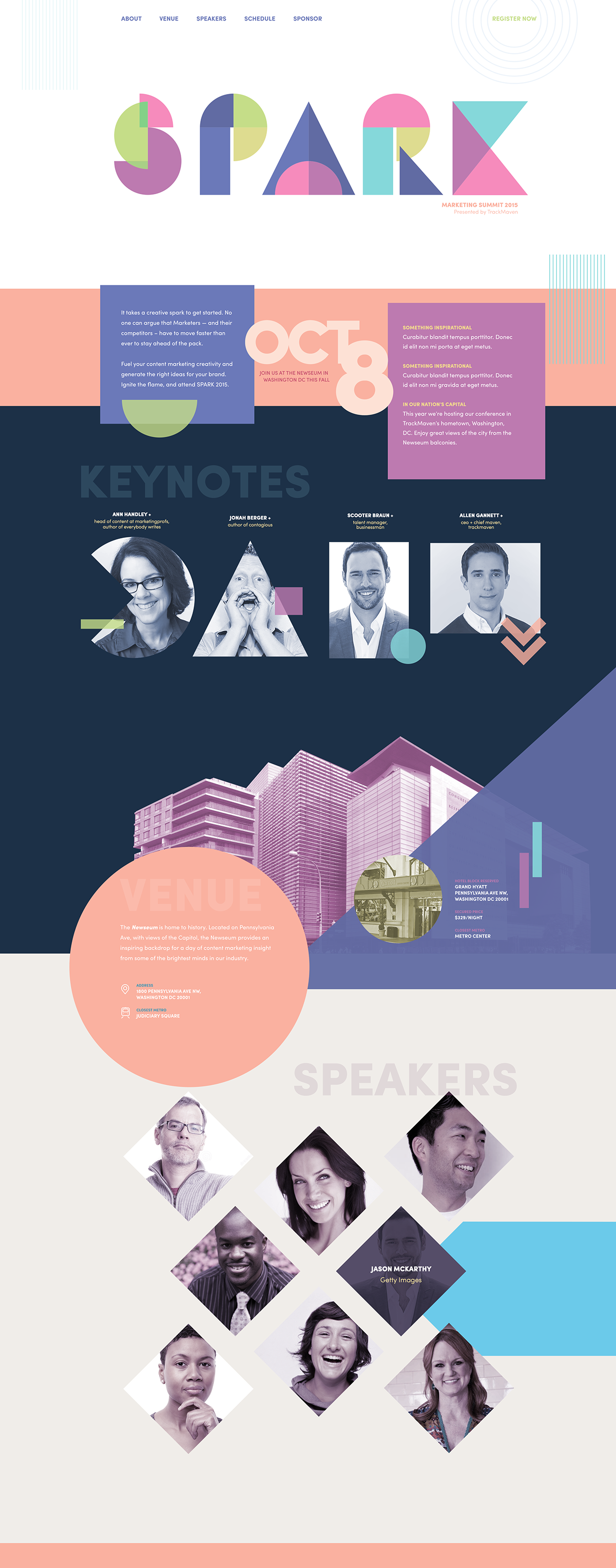
The goal when starting the identity for SPARK was to differentiate it from the other conferences for marketers. Inbound by Hubspot and Dreamforce by Salesforce were my primary targets, and I noticed they were cluttered, busy and corporate. I wanted SPARK to stand out, to be vibrant and interesting.
I began by collecting inspiration for the conference and creating a moodboard to narrow in on a theme. It quickly became clear that bold, bright colors and shapes (or as my design team lovingly called them, shaps) was the direction I was inspired to go.
I worked on a couple versions of my concept before it was turned over to Emily to take further. In the initial version I worked to figure out our color scheme and some of the initial elements of the design. At this stage, a logo had not been created yet, and I wasn't sure if I wanted a fully custom logo, or something as seen in the image below that playfully got the message across while not being overly complex.

I wasn't really feeling the squares for the logo — it felt like nautical flags, and was hard to read. I paused on the design for a moment to work on the logo concept and came back with something that harkened back to my moodboard. It felt faceted, shapey and fresh. I took those elements into the other parts of the page, speakers, call outs, etc and finally felt like I was getting somewhere.
At this point, Emily had joined our team and her first assignment was to take over this project. When we sat down, the first thing that stood out was how pastel it was. While we all loved the color combinations, it didn't feel appropriate for the event we were planning, so we decided to adjust the colors.

Throughout our work, the shapes were combined in two distinct ways.

We integrated triangles in a faceted manner to illustrate the growth and connection of cogent ideas and creative sparks. These patterns were implemented as background images to create a supportive backbone when visual appeal needed to take a backseat to straightforward content.

To illustrate the chaotic experience of innovative thought, we also experimented with randomly-integrated, bold, and multi-hued shapes. While we were careful to create balance in all of our collateral, the scattered arrangements provided us with unlimited opportunities for visual interest.
Digital Assets
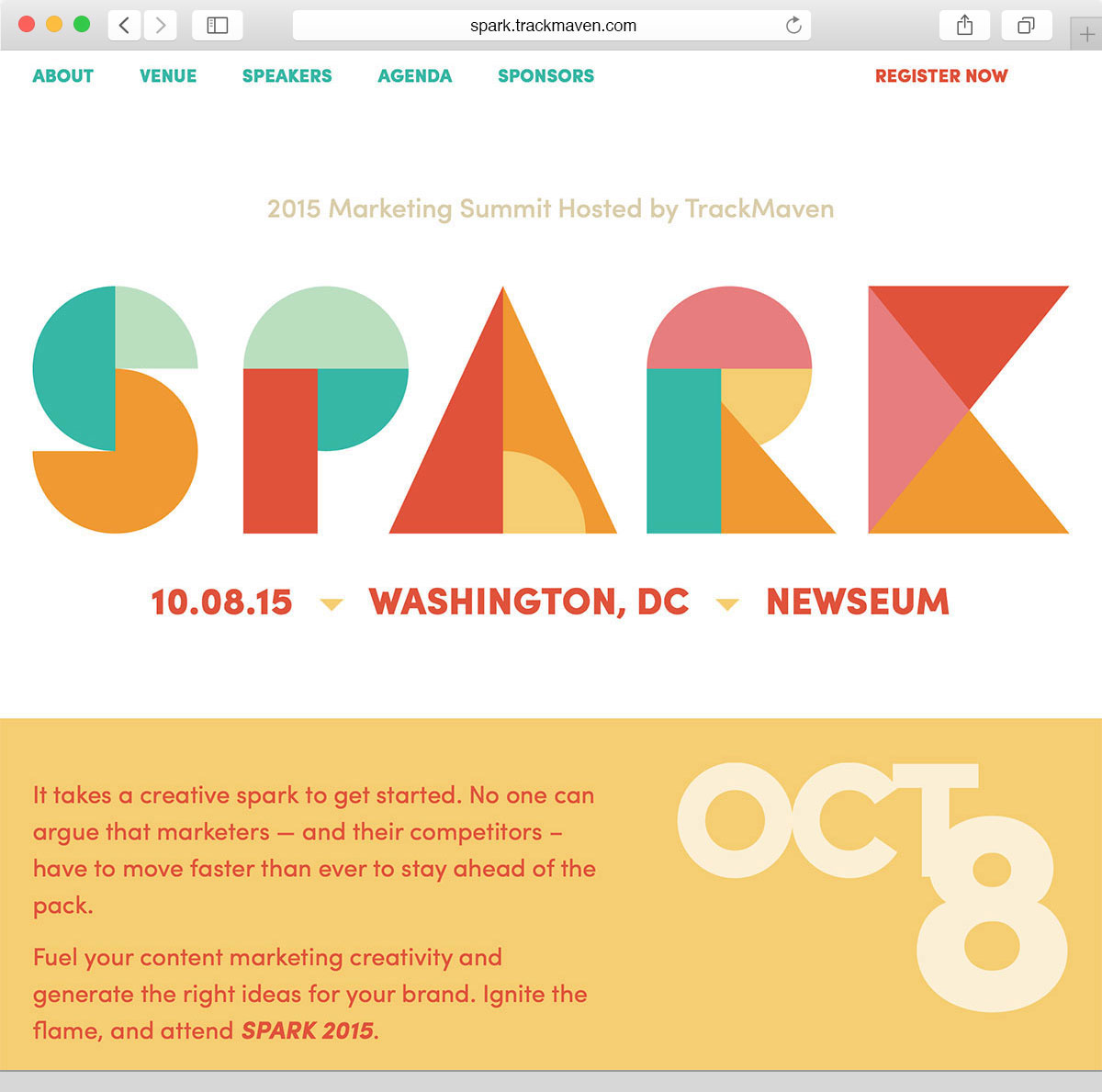
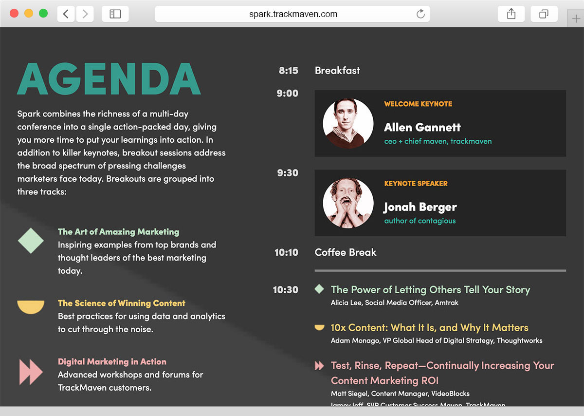
The key digital deliverables involved were the website and social media graphics. For the sake of simplicity, we decided on a single-page layout and implemented modal windows for users who wanted to dig deeper into the content. Each section is clearly indicated by a contrasting change in background color, and is easily accessible via anchor links and scrolling. Like any good event website, we set off the registration button, contrasted it with our most urgent color, and added an animation to draw the users’ attention.
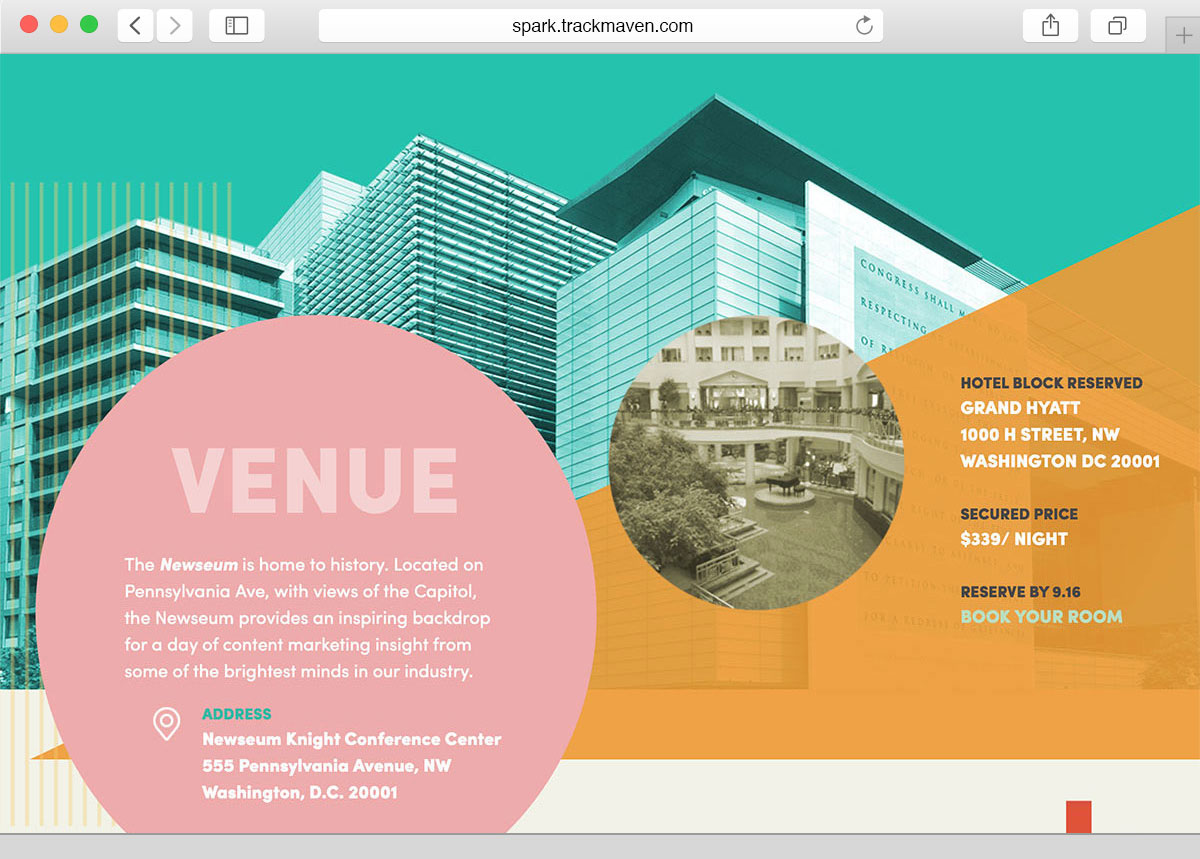
To break up the visual symmetry of the speaker sections, we decided to use seemingly-random shape placement for the venue and hotel information. Because there wasn’t a lot of interactivity happening here (aside from the hotel link), we decided it would be ok to randomize the structure a little, and maintain the fun, chaotic aspect of our brand.
Physical Assets
The most fun part of all of this, at least for me, was the environmental design. We brainstormed a lot about how to make the event special for guests both in the environment around them, and the things they touched. We had some pretty crazy ideas, but budget and restrictions from the Newseum required us to step it back just a bit.


Foamcore became our friend for the conference. Seven, four foot by eight foot panels lined the stage to give us a full width backdrop.
Because the conference was being held on two different floors and in slightly confusing room locations, we created wayfinding signs around the conference center to help our attendees.
. . .

All attendees were provided with an embroidered Spark swag bag, Ann Handley’s best-selling book, a Spark-branded notebook, and a TrackMaven pen. We used embroidered bags instead of typical screen printing to add another unique dimension to our collateral
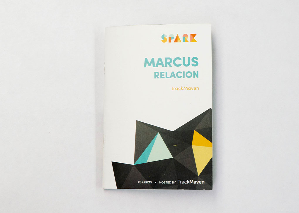
The program was a focal point of the physical materials. It doubled as a name badge, which saved us the time and cost of creating an entirely separate name badge.

Because it remained on each attendee’s person throughout the day, they were able to reference the program when needed.
Audio / Visual
One thing I do when I work on big projects is listen to music that relates to it. I knew we would have speakers in the venue and plenty of chatting time between sessions, and I wanted to fill that dead air with music that was the essence of the event. I began a SPARK playlist on Spotify and kept adding to it as I came across good music that matched the vibe we were going for.
Designer Blake Wilton was our resident animation pro, so we enlisted him to create an opening animation for the event before the conference started, as well as intro slides for our keynote speakers.
Our goal for the introduction video was to simply add life and movement to the brand. This added a layer of sound and inertia provided our attendees with another exciting experience to jumpstart their day. Creating this video allowed Mavens who weren't on the Communications team to also participate in the creation of our identity. Nick Licitra, our Junior Software Engineer, provided his talents in the form of sound production. At the end of the day Nick and Wade Hammes, our Front-end Developer, set the tone for our evening reception with their DJing prowess.


Results
Our hashtag #SPARK15 trended nationally 90 minutes into the conference.

We hit our peak Twitter engagement for that week on the day of the conference.

Our attendee count increased by 59% from the previous year’s conference.

Spark Production Team:
Emily Unroe, Laura McGuigan, Blake Wilton + Marcus Relacion
The conference went off without much of a hitch and we all had a lot of fun putting it together. We were able to reuse a lot of the materials for the 2016 conference and streamlined a lot of the process. Our biggest takeaways on things to improve were:
- Improve upon the logo so that it works well as a knock out, one color logo.
- Communicate earlier and more clearly on the A/V needs and timing. We had some hiccups at the beginning of the day with the technicians at the Newseum because we hadn't initially included video in our program.
- Simplify the wayfinding signs, or work with the Newseum to create a better layout and use of space.
✌️