
Matter: Diversity + Inclusion Platform
Getting insights to take steps to improve diversity within a company is difficult when there is a lack of buy in, cumbersome tools and a lack of focus. Matter aimed to improve this by integrating with existing HRIS tools to visualize data in the ways that were important to understand trends and red flags.
UI Design, Logo Design, Branding and Collateral,
UX Design, User Research
Challenge 1: Understand what we're trying to build
Problem
Everyone is trying to solve diversity, but in order for us to fully understand the problem and how we planned to tackle it, we have to understand what job the product was doing and how it was invested in the individual user.
Solution
Through a combination of individual online research, group chats with potential users, and brainstorms amongst the team, we would be able to more clearly define our product's goal and use cases.


We kept in constant touch with our alpha testers throughout our design-build process, chatting with them almost daily to get their feedback and understand whether we were on the mark or not. After a few initial conversations, combined with our own research and product understanding, we sat down to develop the jobs to be done and sketch out how we thought best to present the information.
. . .
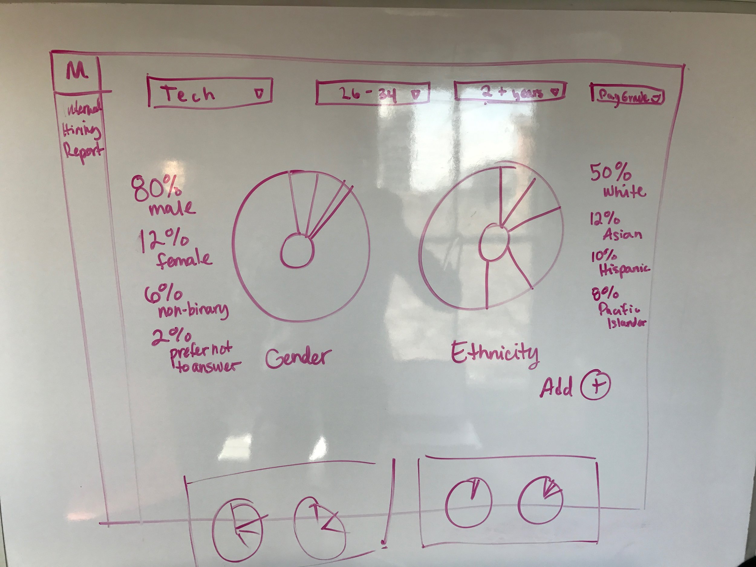
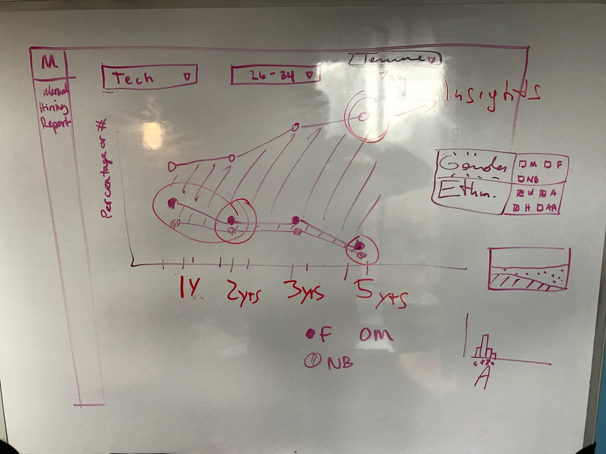
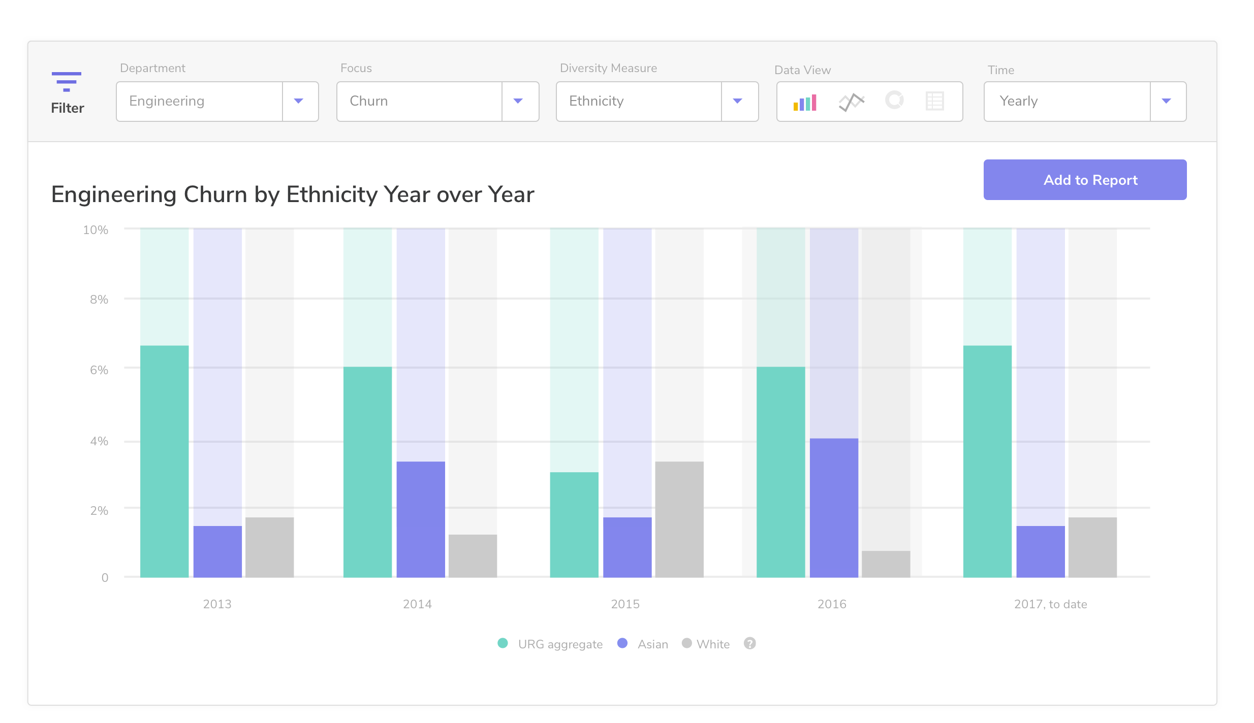
Initially we chose donut charts to show the clear differences between gender and ethnicity, but realized quickly that those only allowed for 'at this moment' understanding of the data. We began exploring timeline based visualizations to more clearly show the changes. This timeline based visualization also made it easier to compare against other data sets (whether it was another company, or just another type of stat) easily. After a day of brainstorming, we came away with our initial structure for the app: Overview and Comparison. This concept would follow us throughout our future iterations.
. . .
Part of my research, other than a ton of reading on ways companies are working to improve their diversity and following a bunch of diversity leads to get their hot-takes, was to conduct a survey of tech employees to gauge the general interest and concerns they had. After all, the point of improving diversity in tech was to improve based on the employees' feelings, so having some semblance of a base line allowed me to look at it more clearly from their perspective.


Challenge 2: Create a simple interface that highlights diversity issues.
Problem
Diversity professionals rely on clunky HRIS (human resource information system) dashboards, exporting the data to spreadsheets and pivoting it to the moon and back to get some useful insight from it.

What the raw data looked like from an HRIS export
Solution 1
Provide a clear overview of information from their HRIS in a presentable way so that Diversity professionals can share with upper management with confidence.
The goal of the initial release of the product was to clearly show the user how their company was doing when it came to diversity. For this reason, a baseline needed to be formed in the shape of a dashboard with fixed screens. They could get screenshot-able (and eventually exportable) views across different functions, different time frames, and across both gender and ethnicity on the dashboard.

. . .
Solution 2
Create a reporting tool that allowed users to compare what mattered to them.
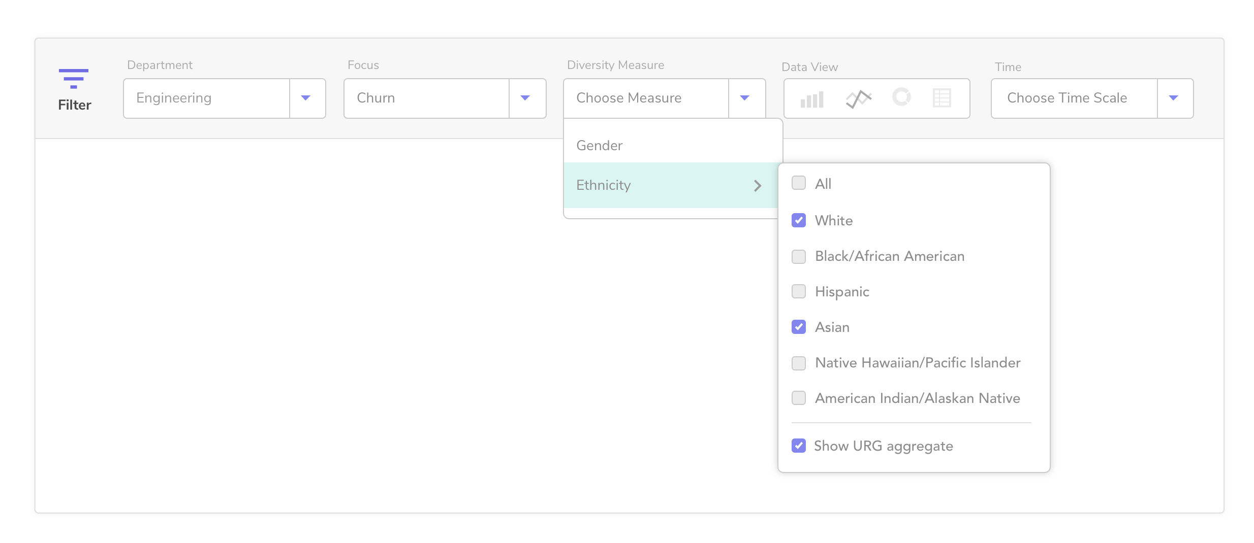
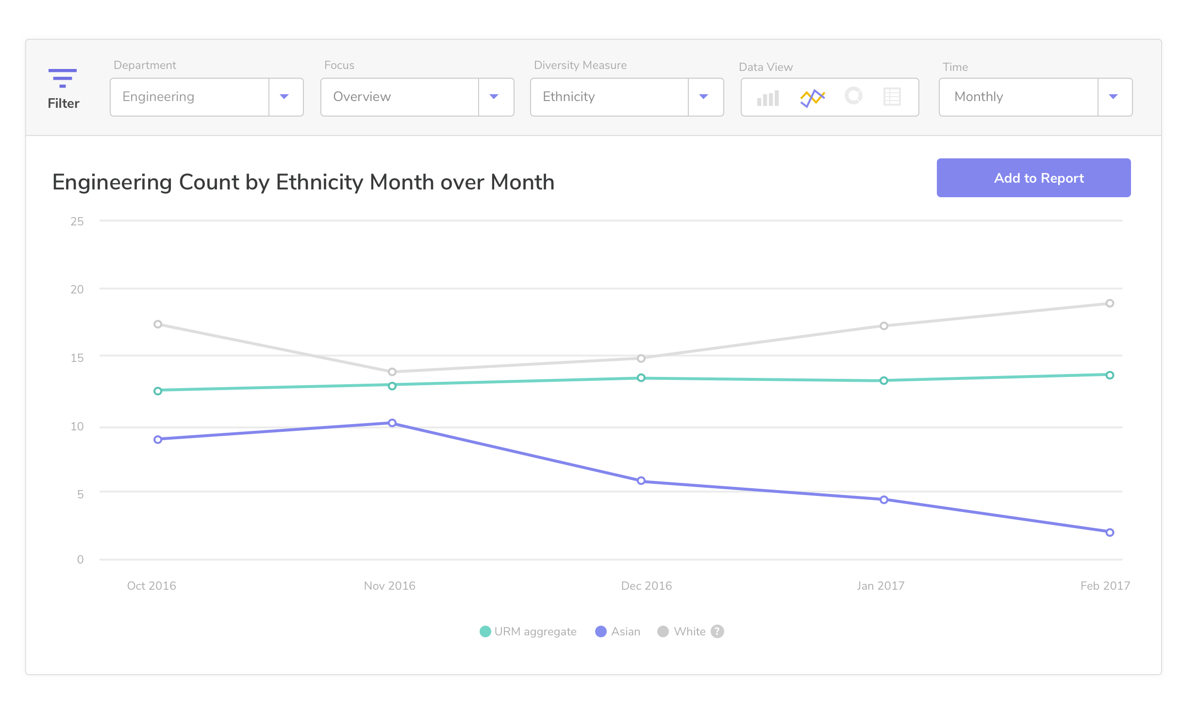
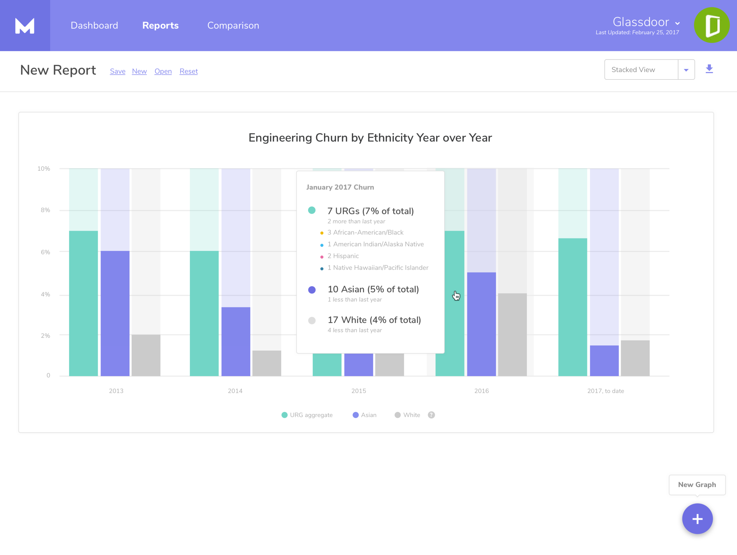

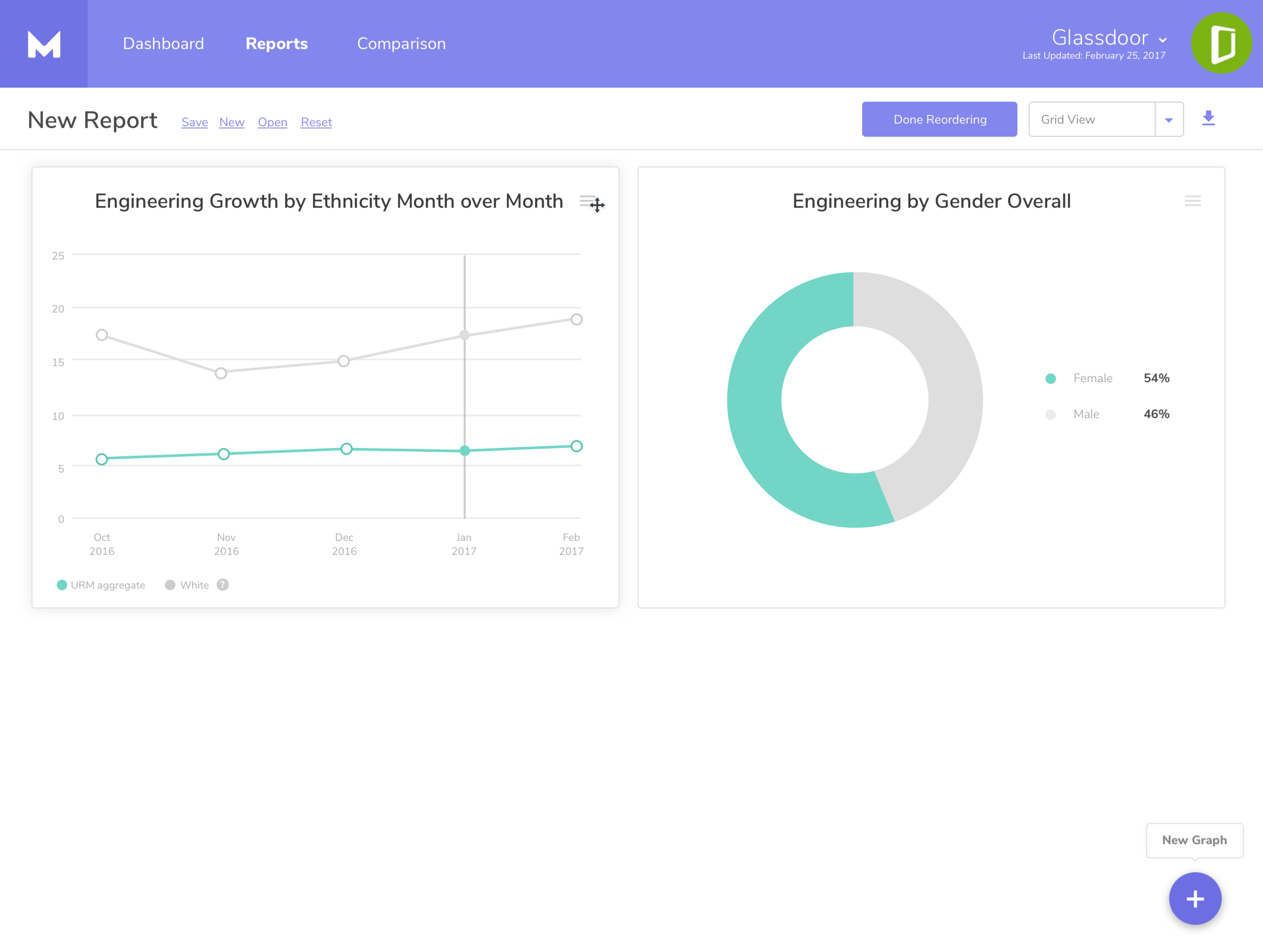
We gave users the ability to view the data in the way they wanted, with certain options greying out if they were inappropriate (i.e., snapshots were only useful in a donut). This reporting tool also allowed them to reorganize and layout the graphs in different ways to highlight what information was most important.

URGs combined to show an overview tally of each 'group' over time.
We made a clear decision early on to downplay the majority, White Male, during development. At the end of the day, tech's biggest problem is that it's too white and too male, and by downplaying the percentage those categories took up on the charts, we were able to show how little was left. In an effort to consolidate information to what we understood to be a true goal, we combined all Under Represented Groups (URGs) to show them against Asian and White, which are dominant ethnicities in tech.This did present an interesting problem when working with a primarily female-driven company, so the ability to choose what ethnicity or gender you are trying to downplay would be helpful in a future release.
Challenge 3: Fix the hiring pipeline
Problem
Without understanding where their pipeline is failing, hiring managers cannot truly help diversity staff improve the candidates coming in the door.
Solution
Provide a tool that shows correlations between diversity and hiring pipeline.
We wanted to cross reference the hiring steps with applicant-provided data to determine if there was a correlation in drop-off. This would help recruiters and HR staff understand where to tweak their hiring processes and visualize the issues quickly to get buy-in from management. They could also review sources to determine whether a pool of applicants is diverse and whether user should continue to spend money there. All of this information would come from their ATS (applicant tracking system) and would rely on voluntary data from the applicants.
Unconscious bias makes up a large portion of feedback that leads to a non-diverse culture. I explored unconscious bias through NLP technology. Could we uncover someone's bias based on the comments they left after they interviewed a candidate?

A quick note about non-binary genders and non-represented ethnicities
Unfortunately in our first pass we had to rely on HRIS data that solely showed information collected under a certain standard. This standard was informed by the EEO-1 forms that companies have to fill out once they reach a certain size. Our long term goal was to include our own survey data, effectively removing that information from their HRIS and allowing us to create a more accurate representation of the levels of diversity within a particular organization.
Challenge 4: Establish a trustworthy identity
Solution
Update the identity to connect with a range of audiences in the tech industry. Be aware of trends, as well as unconscious bias when making design decisions.
Problem
Prior to joining the project, Matter had a heavy identity — bright yellow and black made for an aggressive and masculine feel that did not match up with what was needed to successfully position the brand.


